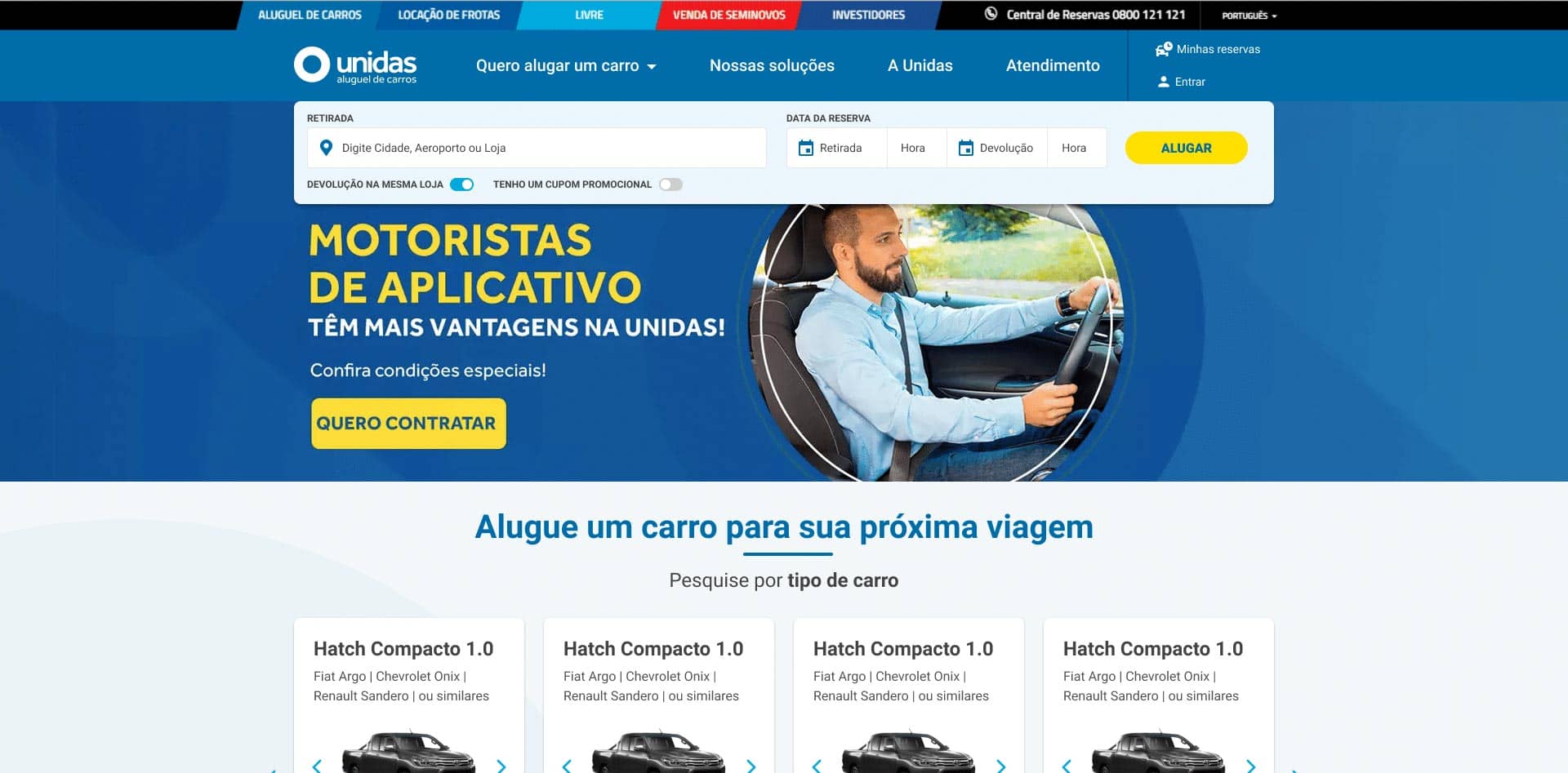
Unidas’ national portal – Used Cars
Project Overview:
- Unidas Seminovos’ national portal is a prominent platform for purchasing used cars.
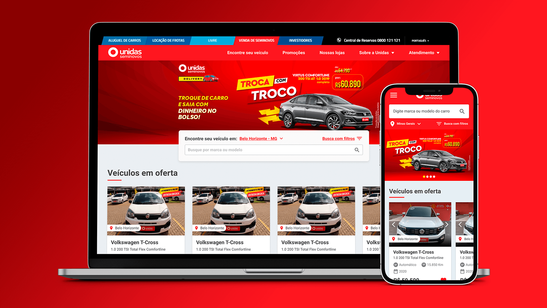
- The project, undertaken at Stripe Digital, involved the complete design of the user experience from inception to execution. The primary objective was to optimize lead acquisition and management while ensuring a cohesive and intuitive design for users. The portal can be viewed live at seminovos.unidas.com.br.
Assumptions:
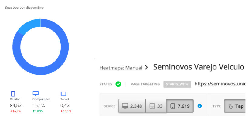
- The design approach followed a “Mobile First” strategy, prioritizing mobile user experience and responsiveness as the foundation for the overall design.
Goals:
- Focus on lead acquisition and treatment: The design aimed to streamline the process of capturing and managing leads effectively.
- Create a consistent design: Consistency in design elements and user interface across the platform was a key goal.
- Segmentation by regional market particularities: The design accounted for regional variations and preferences to tailor the user experience accordingly.
Process:
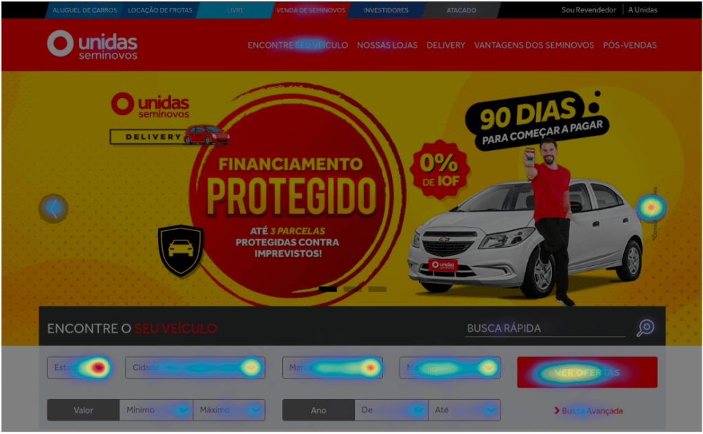
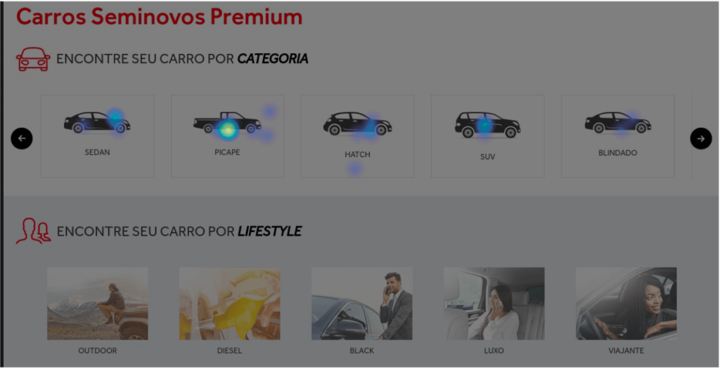
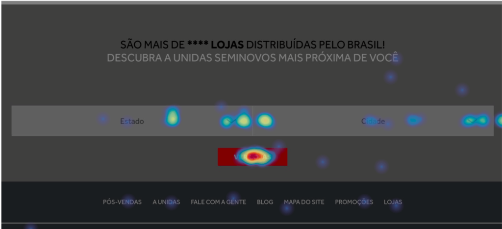
- Heat Maps Analysis: Utilizing the Hotjar tool, an analysis was conducted on the existing portal over a span of 3 weeks, involving over 1000 users and 20241 pageviews. Key user actions observed included navigation patterns, search interactions, engagement with internal offers, and contact interactions.
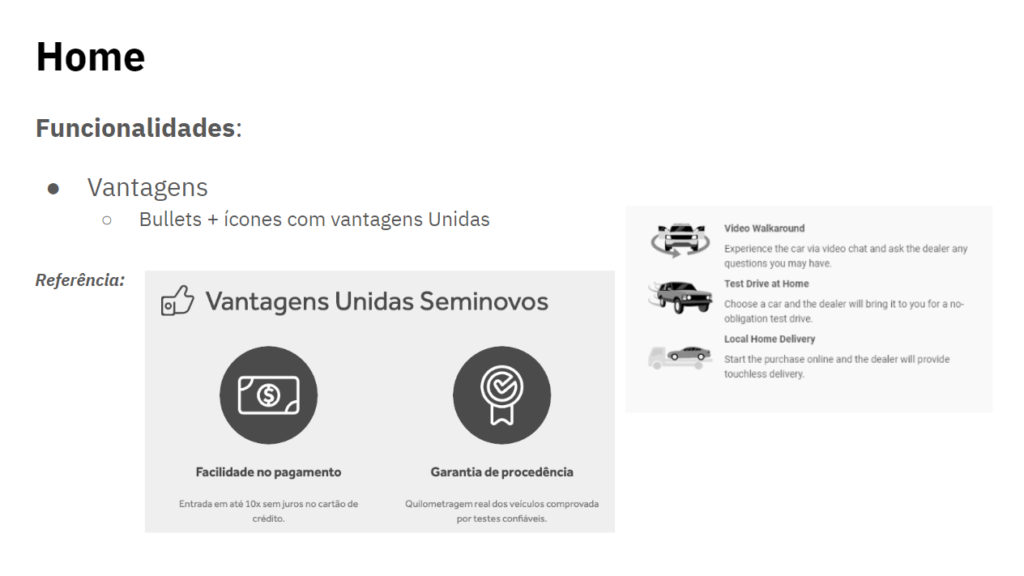
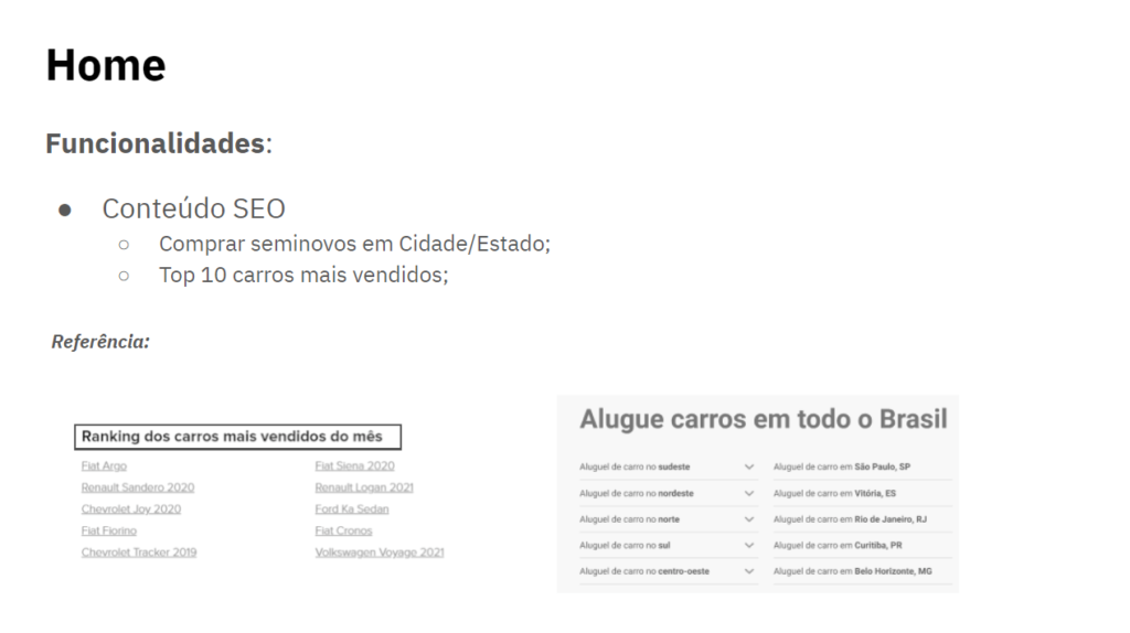
- Benchmarking: Benchmarking involved analyzing national and international competitors, as well as innovative industry leaders. This comparative analysis helped identify best practices and areas for improvement.
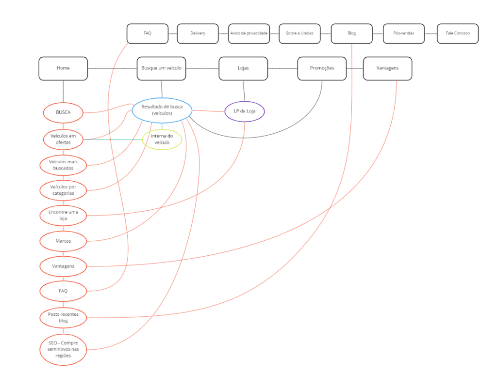
- Sitemap: A basic sitemap was developed, outlining the navigation flows and structure of the portal to ensure intuitive user journeys.
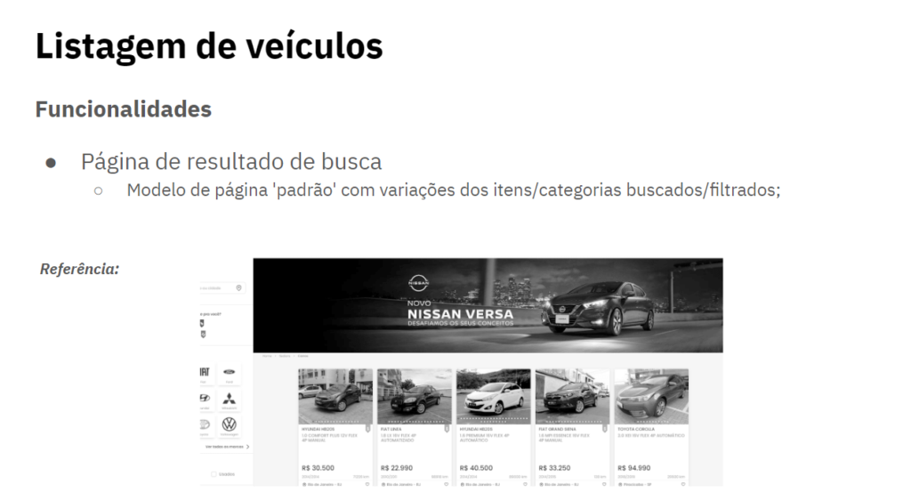
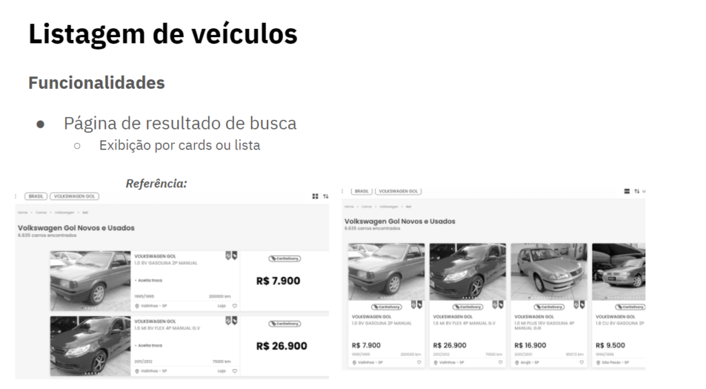
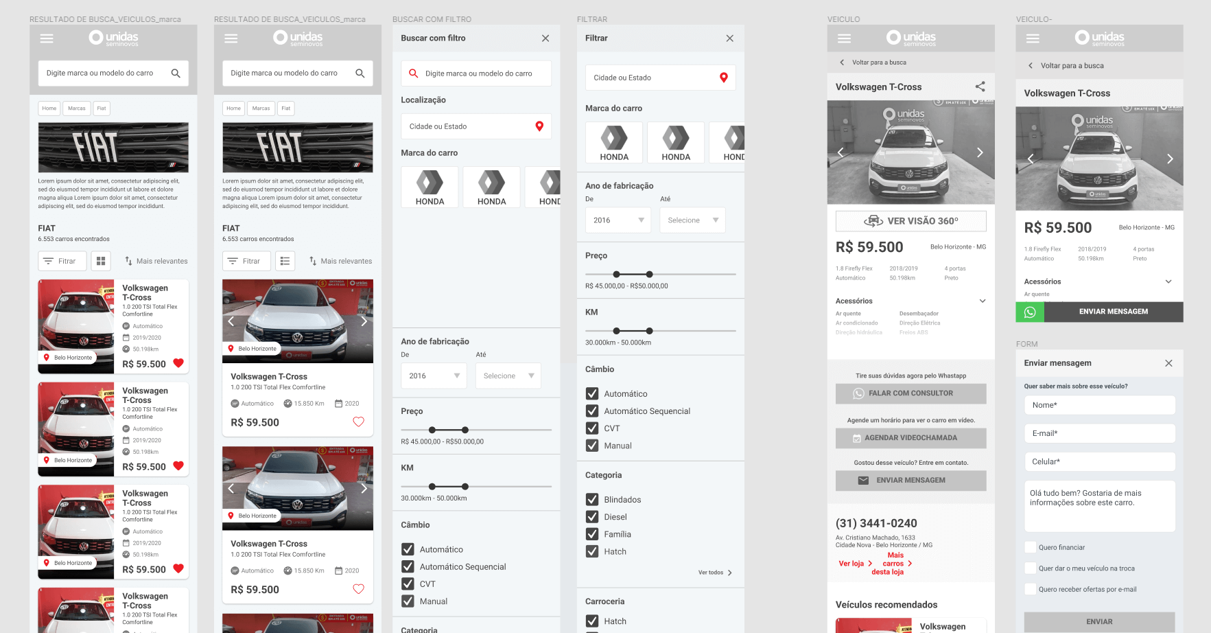
- Wireframes: Wireframes were created to outline the layout and functionality of key pages, providing a blueprint for the user interface design.
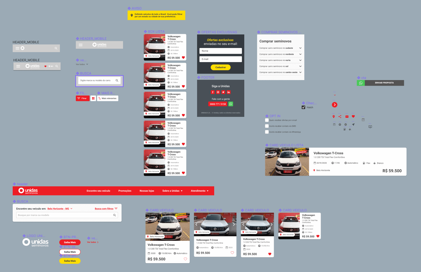
- UI Design: Modular Structure: The UI design adopted a modular structure with adaptable component patterns. This approach facilitated scalability and consistency across the platform while accommodating regional variations.
Key Findings:
- Heat map analysis revealed insights into user behavior, guiding the design process to prioritize key functionalities such as navigation, search, and contact interactions.
- Benchmarking highlighted industry best practices and innovative features that informed the design direction for the portal.
Implementation and Results:
- The modular structure and cohesive UI design were successfully implemented, resulting in a seamless user experience that aligned with the project goals.
- Post-implementation analysis indicated improvements in lead acquisition and user engagement, validating the effectiveness of the design approach.
Key Learnings:
- Emphasizing a “Mobile First” approach proved beneficial in catering to the growing mobile user base.
- Consistency in design elements and regional segmentation are essential for catering to diverse user preferences and optimizing user engagement
Assumptions
Mobile First
Goals
- Focus on lead acquisition and treatment
- Create a consistent design
- Segmentation by regional market particularities
Process
A summary of the process carried out in this project:
Heat Maps
The analysis was carried out, using the Hotjar tool, on the portal in force for 3 weeks with +1000 users and +20241 pageviews. The main actions observed are: navigation, search, internal offer and contact us.
Benchmarking
For benchmarking, sites segmented as follows:
- National Competitors
- International competitors
- Innovation
Sitemap
Basic sitemap with flows of the navigation pages.
Wireframes
UI Design: Uma estrutura modular
Modular structure with adaptable components patterns.
Prototype
Use the arrow keys on the keyboard to navigate through the pages in the prototype.

